Friday, June 27, 2008

Red and Green and More R's

After posting the R is for Repair I saw this image on Kris's Color-Stripes. It is a blog that has beautiful images and then she breaks them down into colors. This is like an exercise that we did in art class in the 8th grade with Coach White. We had to keep a notebook of colors and write down all the colors in the photo. Kris's shows the colors which is more fun. So in keeping with the red and green theme included is more of the same with the color breaks.

There are more R's on the stairs landing. Letters are showing up everywhere as a design element in rooms. So the above photo has not only the red and green, but letters.


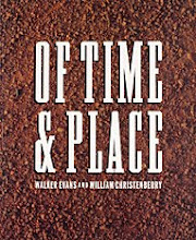
This one is a little of a stretch, but it has peeling paint and it does continue the letter theme.

Thursday, June 26, 2008

Tags

Suzanna Scott of Sushipotpart's tags. Via Automatism.

Wednesday, June 25, 2008

R is for Repair

The red chest to the left with the green R is a great visual. Normally I do not like these colors together except at Christmas and only if there is a lot of white, but this seems to work. The patch on the floor is the best. At our house anything is better that has a repair.

(Photos by Marie-Pierre Morel). Scanned from a late 1990s edition of Marie Claire Maison (sorry to be so vague about the date -- I'm working from a stack of files, the result of years of magazine clippings). Credit copy and photo from Automatism.

Tuesday, June 24, 2008

More Image Boards


It is funny that as much as I like pictures of image boards and the idea of them that I do not have one. Last year I drug home some shutters from a neighbor's trash and used them for a while to showcase some things, but postcards had to be attached with a clip. The shutters were not ideal so I sold them to an antique dealer friend.

The boards in a frame have a feeling of confining all the miscellaneous stuff that is on them which is good. All the three dimensional items add so much interest. For some strange reason I am attracted to the items and type that are covered with the glass glitter.

Via Desire to Inspire.

Monday, June 23, 2008

Image Boards

The heart with the wings, quelling and ribbon is beautiful. It would make a beautiful valentine heart to send. The question is how can the essence of the heart be changed so it can be mailed. My valentines from this year probably arrived flat and the hearts may not have separated when removed from the envelope.

Rochambeau Via All Things Bright and Beautiful.

Friday, June 20, 2008

Matthew Mead Style

Wouldn't you know it I threw away some old books yesterday morning and then saw a use for them on this site. It was too late to did them out of the trash as the garbage men had come and gone. A couple of weeks ago it was the wooden shoes in the courio cabinet. All this cleaning out maybe causing me some problems! I did save the end covers of the books to make little collogues of my grandparents. Completing one project is more important than storing things for fifthteen projects and never using the materials.


I had forgotten about the talented Matthew Mead and his web site. Thanks to Desire to Inspire I have revisited his site. This season the color scheme is cream and taupe. What is so refreshing about his style is that every season there is a different color scheme and all the departments follow suite. All images from Matthew Mead Style via Desire to Inspire.

Saturday, June 14, 2008

White on White

This place looks as if it is a summer cottage; light and clean.


The silver gives a polished look to all the white and green.

You can never have enough ball of string.

Three piles of magazines next to the bed. Who would ever get up?

All the chipped paint looks good in the photos, but does it look a little unkempt in person? Did a stylist put the same lantern in this photo as the one by the stairs?

Text: Helena Kaasik Foto: Helén Pe Arr: Per Wennberg


Via Skona hem via Automatism.

Friday, June 13, 2008

Double Bloom Hydrangea

This plant has it all; an oak leaf hydrangea and a white blossom that is double.

Monday, June 9, 2008

William Faulkner

Part of the appeal of this photo is that it is of William Faulkner. The dogs are a huge part of the appeal especially the one is the back stretching his legs. These are such feisty little dogs. I like the fact that the dogs and Faulkner have their backs to each other.

Photo d'Henri Cartier-Bresson. Faulkner at Rowan Oak. Magnum. 1949

Sunday, June 8, 2008

Philippe Caillaud

There is a tremendous amount of detail and cutting to be done for each dragonfly.

Grid paper with marks on each wing. The details are amazing on each individual piece.

Different but alike. What movie is that from?

The butterflies on this card reminds me of the gift tags that I made a couple of years ago that had a single solid color butterfly on a patterned paper.


The work of Philippe Caillaud located at Le Vol Du Variable via Desire to Inspire.

Saturday, June 7, 2008

Courio Cabinets

This cabinet has to be the work of a stylist. All the colors are too coordinated. I do like it best of the two, but then it has more natural items than the other. The birds nest in the glass container is interesting. I just found another birds nest while walking the dogs. It was upside down in the street. My cabinet in the studio has a combination of natural items on the top shelves, some handmade books, cigar boxes filled with stamps and feathers and books. It needs an overhaul.

The wooden shoes in the top right shelf are too funny. We just got rid of a pair of these that were used when we did our 18th century living history. I still do not want them back. How much of this stuff do they really like and how much is just something to fill the space? Please do not light the candles while they are in the cabinet.

Second image from GMA Images via Desire to Inspire.

Tuesday, June 3, 2008

Books That Hold Up to Time

We have been going through some of the shelter books in our library and some hold up to time and some do not. Below are some that have. Some that have not have been the Mary Emmerling books on the West, the South. We were amazed when looking through her first book on American Country how many of the photos were in black and white. The books are just filled with too much stuff. Did we like them when we bought them or were they just more books for the shelf and the new book of the moment? I suspect that we have changed in our taste as well as the fact that the books were not that well done to begin with.

The Sensual Home by Ilse Crawford was first published in Britain in 1997 and the United States in 1998. The type in this book can be a little hard to read at times as it is a san serif and when black type is on a red background the vibration of color can make it hard to concentrate on the copy.

A Room of Her Own women's personal spaces by Chris Casson Madden was published in 1997.

The Garden Room bringing nature indoors by Timothy Mawson was published in 1994. It has amazed me how many of the spreads that were in the book I also found in different shelter magazines over the years. I use to save those pages, but I have changed.